Ever stared at a flower and genuinely could not decide if it was violet or purple? You are not alone. These three colors sit so close together on the visible spectrum that even scientists and artists disagree about where one ends and the next begins. Violet vs Indigo vs Purple. This guide cuts through the confusion once and for all — covering wavelengths, history, symbolism, color mixing, and real-world identification tips so you can use each term with total confidence.
Scientific Definitions: The Real Spectrum Positions
To understand these colors at their core, you have to start with physics. Visible light is a narrow band of electromagnetic radiation. Human eyes can detect wavelengths from roughly 380 nm (nanometers) to 700 nm. Every color you see in a rainbow corresponds to a specific wavelength range — and that is where violet and indigo live. Purple, however, is a different story entirely.
Violet: A True Spectral Color
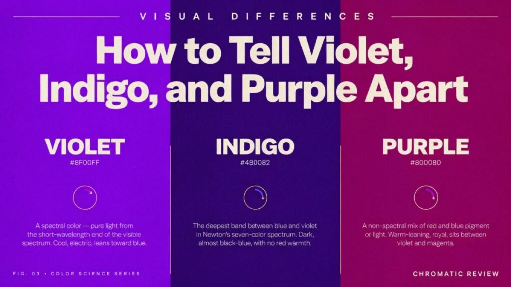
Violet occupies the very end of the visible spectrum, sitting at approximately 380–450 nm. Because it has the shortest wavelength detectable by human eyes, it sits just before ultraviolet light — the range that is invisible to us. Violet stimulates blue cone cells strongly and red cone cells weakly, which gives it that distinctive electric, slightly cool glow.
Key physical facts about violet:
- Wavelength: 380–450 nm
- Hex code (digital): #7F00FF
- RGB: (127, 0, 255)
- Position: Last color before ultraviolet in the visible spectrum
- Appearance: Cool, bright, slightly reddish-blue — lighter than indigo
One important note: true spectral violet cannot be perfectly recreated on a screen or canvas. Screens mix red and blue light to approximate it, but a genuine violet wavelength is a single frequency of light, not a blend.
Indigo: The Controversial Color
Indigo sits between blue and violet on the spectrum, at approximately 420–450 nm. Isaac Newton famously included it as one of the seven rainbow colors (ROYGBIV), but modern scientists frequently debate whether it deserves its own category. Many researchers argue that the human eye cannot reliably distinguish indigo from deep blue or dark violet without side-by-side comparison.
Despite the debate, indigo has a clear visual identity once you know what to look for:
- Wavelength: 420–450 nm
- Hex code: #4B0082
- Appearance: Dark, rich, blue-dominant with subtle violet undertones — often described as “navy with a purple whisper.”
- Key distinction from violet: Darker, cooler, and leans toward blue rather than red-purple
Many modern scientists argue indigo is more of a transitional band than a standalone hue, but its cultural and historical identity is undeniable.
Purple: A Color Your Brain Creates
Here is the twist most people do not expect: purple does not exist in the light spectrum. No wavelength of light corresponds to purple. Instead, purple is a non-spectral color — your brain constructs it when red and blue wavelengths stimulate their respective cone cells at the same time.
This is why purple never appears in a natural rainbow. Rainbows display pure spectral light. Purple requires both the short-wavelength (blue) end and the long-wavelength (red) end of the spectrum to fire simultaneously — something a rainbow’s sequential progression cannot produce.
- Wavelength: None (non-spectral)
- Hex code: #800080
- RGB: (128, 0, 128)
- Appearance: Warm, rich, balanced between red and blue — can skew warmer (reddish-purple) or cooler depending on the mix
Purple is the broadest term of the three, covering a wide family of shades from lavender to deep plum.
Visual Differences: How to Tell Violet, Indigo, and Purple Apart
Quick Identification Table
| Feature | Violet | Indigo | Purple |
|---|---|---|---|
| Spectral? | Yes | Yes | No |
| Wavelength | 380–450 nm | 420–450 nm | N/A (mixed) |
| Hex Code | #7F00FF | #4B0082 | #800080 |
| Warmth | Cool, slightly red-tinted | Cool, blue-dominant | Warm to neutral |
| Brightness | Lighter, more vivid | Darkest of the three | Medium |
| Appears in rainbow? | Yes | Yes (debated) | No |
| Created by mixing? | Approximate only | Approximate only | Yes (red + blue) |
How to Spot the Difference Fast
Violet — Ask: Does it look bright, slightly electric, and lean toward a cool blue-red? Is it lighter than expected for a “dark” color? That is likely violet.
Indigo — Ask: Does it look deep, dark, and primarily blue — like the night sky just after sunset but before full darkness? That is indigo. If it looks like dark denim with a purple tint, trust that instinct.
Purple — Ask: Is there an obvious balance of red and blue — warmer than violet, clearly not a dark navy? Does it look like what most people would call “purple” without thinking twice? You have found purple.
Historical and Cultural Context
Violet: The Color of Mystics and Royal Gardens
Violet has deep roots in spirituality and religious imagery. Medieval painters used violet in depictions of saints and the Virgin Mary. In Christian liturgical tradition, violet robes appear during Lent and Advent as symbols of penance, sacrifice, and preparation. Ancient civilizations connected violet light to divine energy because of its position at the edge of human perception — hovering at the threshold of the invisible.
The word “violet” itself existed before formal color science.
Indigo: A Dye That Shaped Civilizations
Few colors have shaped global economics quite like indigo. Extracted from the Indigofera tinctoria plant, indigo dye was one of the most traded commodities in the ancient world — so valuable it earned the nickname “blue gold.” Egypt, India, Mesopotamia, and West Africa all developed independent traditions of indigo dyeing long before global trade routes connected them.
During the colonial era, European powers forced indigo cultivation across the Americas and South Asia, reshaping labor systems and agricultural economies on a massive scale. In the 19th century, when German chemist Adolf von Baeyer synthesized indigo artificially (winning the Nobel Prize in the process), the market for natural indigo collapsed almost overnight.
Today, indigo’s most visible legacy is the pair of jeans in your wardrobe. The iconic blue of denim owes its origin entirely to indigo dye traditions dating back thousands of years.
Purple: The True Royal Shade
Purple’s royal associations are not myth or marketing — they are rooted in genuine scarcity. Tyrian purple, the most prized shade of the ancient world, was extracted from the mucus glands of Murex sea snails. Producing a single gram of dye required thousands of snails, making Tyrian purple worth more than gold by weight. Only emperors, monarchs, and the highest-ranking clergy could afford it.
The association between purple and power was so entrenched that in ancient Rome, wearing purple without imperial permission was literally illegal. When British chemist William Henry Perkin accidentally synthesized the first artificial purple dye (mauveine) in 1856, he sparked a color revolution — purple suddenly became accessible to everyone and permanently transformed the fashion industry.
Symbolism and Emotional Interpretation
Violet Symbolism
Violet carries associations with:
- Spirituality and transcendence — linked to the crown chakra in Eastern traditions
- Creativity and imagination — often used in artistic and magical contexts
- Transformation — its position at the threshold of the visible spectrum symbolizes the liminal, the in-between
- Sensitivity and intuition — violet is frequently used in therapeutic and healing environments
Indigo Symbolism
Indigo’s psychological profile leans toward the deep and introspective:
- Wisdom and perception — associated with the third eye chakra and inner vision
- Depth and mystery — the color of the night sky and oceanic darkness
- Stability and focus — used in spaces designed for concentration and meditation
- Tradition — tied to ancient craft and cultural heritage through its dyeing history
Purple Symbolism
Purple carries perhaps the richest symbolic vocabulary of the three:
- Royalty and luxury — the strongest association across Western culture
- Power and ambition — used by political leaders and brands seeking authority
- Creativity and individuality — the go-to color for artists, innovators, and nonconformists
- Mystery and magic — common in fantasy, spiritual, and esoteric imagery
Color Mixing in Art and Design
Mixing Violet
Violet is notoriously tricky to mix because true spectral violet cannot be replicated with pigments. Artists approximate it using:
- Ultramarine blue + small amount of red (or magenta) — gives a clean, vivid violet
- Avoid black — it muddies the tone immediately
- Cool blues work better than warm blues (cerulean will pull the mix green)
- For digital work: use hex #7F00FF as a starting point and adjust saturation
Mixing Indigo
Indigo needs depth without becoming muddy:
- Phthalo blue + a small amount of violet or purple — creates that characteristic deep blue-violet
- Add a tiny touch of black or burnt umber for depth, but use sparingly
- In watercolor, layering thin washes of blue-violet achieves the richest indigo tones
- Digital hex: #4B0082
Mixing Purple
Purple is the most forgiving of the three to mix:
- Equal parts red and blue — produces a standard mid-purple
- More red = warmer, reddish-purple (closer to magenta-purple)
- More blue = cooler, darker purple (sliding toward indigo)
- Use cadmium red + ultramarine blue for a rich, artist-grade purple
- Digital hex: #800080
Creating Accurate Shades: Ratio, Temperature, and Medium
Ratios Matter
Small ratio shifts change everything. A 60:40 blue-to-red split reads as violet. An equal 50:50 split reads as purple. Add a touch of black to either and you approach indigo. Keep a ratio log when mixing physically — replicating a custom shade is nearly impossible without notes.
Temperature Adjustments
Every color has a “temperature bias.” Warm reds (cadmium) mixed with warm blues (cerulean) produce muddy, brownish purples. Always pair a warm red with a cool blue, or vice versa, to keep the mix clean and vibrant. Ultramarine blue (cool) with alizarin crimson (cool-leaning red) produces some of the most luminous violets and purples on the palette.
Medium-Specific Tips
| Medium | Key Tip |
|---|---|
| Oil paint | Glaze violet over white underpainting for depth |
| Watercolor | Layer washes; avoid overworking or colors turn grey |
| Acrylic | Dry slightly darker than wet — test before final application |
| Digital (RGB) | Use HSB sliders for precise hue control; violet sits near 270° hue |
| Print (CMYK) | Deep purples/violets are hard to reproduce — proof carefully |
These Colors in Nature
Violet in Nature
Violet appears in:
- Violets and pansies (the flowers that are named after the color)
- Lavender blooms (though often called purple colloquially)
- Certain orchid varieties
- Amethyst crystals
- The outer edge of a rainbow’s inner arc
Indigo in Nature
Indigo shows up in:
- The twilight sky — that deep blue-purple window between sunset and full darkness
- Deep ocean water at certain depths and angles
- Indigo bunting (a North American bird with striking blue-indigo plumage)
- The Indigofera plant — the source of the dye
Purple in Nature
Purple is rarer in nature than we expect:
- Wisteria and lilac flowers
- Eggplant skin
- Certain butterfly wings (created by structural coloration, not pigment)
- Plums, figs, and some grapes
- Amethyst (often described as purple despite its violet-adjacent hue)
Practical Identification Guide
Checklist
When you see a color and cannot decide which it is, run through these questions:
- Is it in a rainbow or natural light? → Violet or indigo (purple cannot be)
- Does it look primarily blue with a deep, dark quality? → Likely indigo
- Is it bright, electric, and slightly reddish-blue? → Lean toward violet
- Does it feel balanced, warm, and obviously “purple”? → It is purple
- Is it darker than violet but lighter than indigo, with reddish warmth? → Purple
Everyday Examples
| Object | Color |
|---|---|
| Grape Fanta can | Purple |
| Classic blue jeans (original shade) | Indigo |
| Amethyst gemstone | Violet-purple (varies) |
| Violet flower | Violet |
| Barney the dinosaur | Purple |
| Dark night sky just after sunset | Indigo |
| Artist’s ultramarine blue-red mix | Violet |
| Tyrian royal robe recreations | Deep purple |
Designer Tip
In UI/UX and branding, use violet for innovation and energy, indigo for trust and depth (financial, tech, and health brands favor it), and purple for creativity, luxury, and broad emotional warmth. Each has a distinct psychological fingerprint that affects how users feel about your product. Violet vs Indigo vs Purple.
FAQs
What’s the main difference between violet and purple?
Violet is a real spectral color with its own wavelength (380–450 nm) that exists in natural light; purple is a non-spectral color your brain creates by blending red and blue signals — it never appears in a rainbow.
Is indigo actually in the rainbow?
Newton included it in his original seven-color model. Still, many modern scientists argue that indigo is not distinctly visible to most human eyes, making its status in the rainbow genuinely debated.
Why is purple associated with royalty?
Because Tyrian purple dye required thousands of sea snails to produce just a small amount, making it extraordinarily expensive, affordable only for emperors and monarchs throughout antiquity.
How do artists mix violet, indigo, and purple?
Violet uses ultramarine blue with a small red touch; indigo adds depth with phthalo blue and a hint of black or violet; purple blends equal red and blue, adjusting the ratio to shift warmth or coolness.
What do violet, indigo, and purple symbolize?
Violet represents spirituality and transformation; indigo symbolizes wisdom and intuition; purple stands for royalty, creativity, and power.
Conclusion
Violet, indigo, and purple are three distinct identities sharing a neighborhood on the color spectrum. Violet is the true light frequency — precise, electric, and scientifically definable. Indigo is the deep, historical heavyweight — darker, culturally rich, and scientifically contested. Violet vs Indigo vs Purple. Purple is the democratic crowd-pleaser — brain-built, endlessly versatile, and steeped in thousands of years of royal symbolism. Violet vs Indigo vs Purple.
Once you know what to look for — wavelength, warmth, depth, and context — you will never mix them up again. Violet vs Indigo vs Purple. And that moment when you correctly identify a violet flower as violet and not purple? That is the small, satisfying payoff of understanding how color actually works.